

GPT Image 2.6 Product Backgrounds: Keep the Product Recognizable
A useful GPT Image 2.6 product background starts with a clear photograph and a limited editing brief: change the setting, then check whether the product still matches the item you sell. A more attractive scene is not enough if the cap, proportions, finish, or label has changed.
In the Image26 image workspace, choose Image-to-Image when you already have a product photograph. This guide uses a fictional blue water bottle to explain how to prepare the reference, request a new setting, and decide whether the result is usable. The examples are suggested production instructions, not a measured promise of product preservation.
Choose between a cutout and a new scene
First decide whether you need new surroundings or simply need to remove the existing ones. These are different jobs.
| Your deliverable | Start with | Main thing to verify |
|---|---|---|
| A product cutout for an existing layout | The background remover | Edges, holes, transparency, and missing parts |
| A new tabletop or lifestyle setting | Image-to-Image with the original product photo | Product identity, lighting, perspective, and shadows |
| An image that must retain the exact original product pixels | A layer-based composite using the original photograph or cutout | Mask edges, scene integration, and final export |
| A fictional product concept | A new image brief with an explicit creative specification | Whether the invented design fits the brief |
A transparent cutout does not create a new photographic scene. A generated scene does not guarantee that the original product remains pixel-for-pixel identical. If the source product must remain exact, keep it on its own layer and build the setting around it in a conventional image editor.
OpenAI's image generation guide describes consistency and precise composition as areas that can still require review across GPT Image workflows. That general guidance is a reason to inspect the finished asset; it is not a benchmark for the Image26 workspace or a claim about a specific backend model.
Prepare a reference that settles the product details
Choose a sharp photograph with visible edges and enough detail to check the parts buyers will recognize. Avoid using a heavily filtered social preview as your only source if you have a cleaner original. Keep an untouched copy.
For the fictional bottle, make a short identity sheet:
- A straight cobalt-blue cylindrical body, with its original height-to-width proportions.
- A brushed steel screw cap of the same height and diameter as in the reference.
- A narrow silver ring around the base.
- No added handle, strap, pattern, label, or accessory.
For a real product, replace these details with verified facts from the actual item. Note whether the packaging, color, printed quantity, accessories, and surface finish are essential to an accurate listing. A useful reference is one you can compare against, not merely one that looks polished.
If you provide an additional detail photograph, explain its role in the prompt: for example, use the main photograph for framing and the close-up only to check the cap. Follow the reference limit shown for your selected option. More images are not automatically better when they show conflicting colors or different product versions.
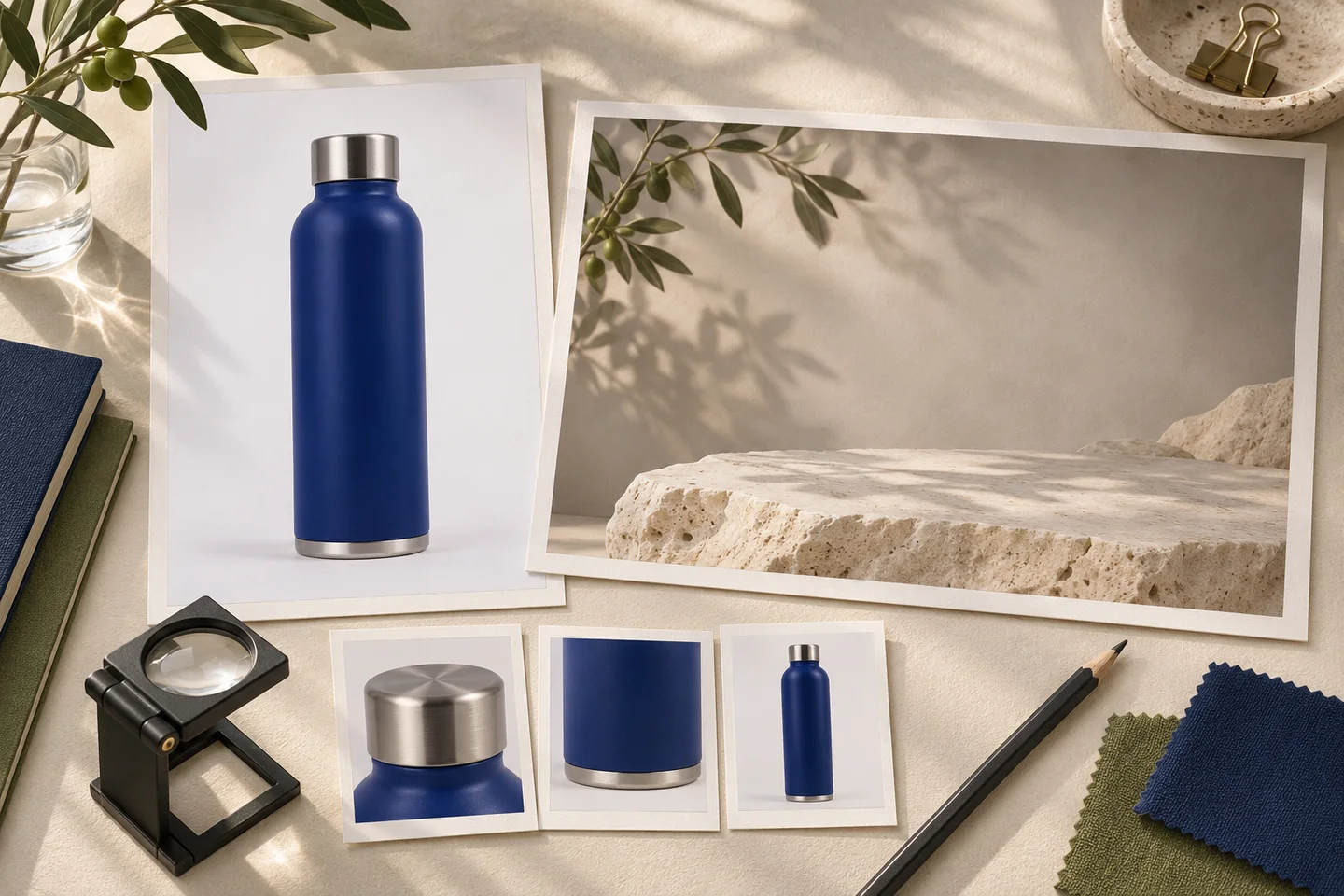
Original generated concept illustration for reference planning. It is not an Image26 interface screenshot, a real product photograph, or a before-and-after result from GPT Image 2.6.
Write the setting around the existing camera angle
A simple setting gives you fewer variables to inspect. For a first attempt, keep the product's camera angle and position, choose one surface, and specify a single light direction. Save a dramatic perspective change for a separate concept.
For the fictional bottle, try this original editing brief:
Use the uploaded photograph as the product reference. Replace the surrounding background and tabletop with pale limestone and a warm gray studio wall. Keep the bottle in its existing position and camera angle. Preserve its cobalt-blue cylindrical body, height-to-width proportions, brushed steel screw cap, and narrow silver base ring. Use soft light from the upper left with a subtle contact shadow where the bottle meets the surface. Leave clear space to the right for copy that will be added later. Add no text, logos, handle, strap, or accessories.
Adapt the materials and position to your source. If the photograph already has strong light from the right, either choose a compatible new setting or explicitly treat the result as a relighting task that needs closer review. A prompt cannot make conflicting source lighting disappear without potentially changing the object's appearance.
Keep the first brief focused on the background. Asking for a new bottle design, a different cap, a rotated camera, added condensation, and a new scene at once makes it harder to tell which change caused an inaccurate result.
Generate one candidate before creating variations
Open the image editing workspace, sign in, choose Image-to-Image, and upload the reference. Paste your adapted brief, then review the selected model, output ratio, resolution, quantity, and displayed credit cost.
Choose the ratio for the final placement. A square listing tile and a tall campaign image need different room around the subject. If the reference is tightly cropped, explain where extra space should go rather than assuming a wider ratio will preserve the original framing.
Start with one candidate. Review it before increasing batch quantity or requesting several scene variations. The pricing section explains available plans and credit packs; the editor shows the cost of your selected request. A completed variation still uses credits when you decide not to use it.
Check product identity before judging the scenery
Download the candidate and compare it with the original at full size. Then look at the size and crop where it will actually appear. Use three separate passes so an attractive background does not distract from a changed product.
1. Compare the silhouette and parts
Check the bottle's height-to-width proportions, shoulder transition, cap width, and base ring. Look for an added seam, missing component, altered opening, or a change in the apparent material. For other products, the equivalent details might be a bag's handles, a shoe's sole, or a device's controls.
2. Compare color, finish, and printed information
Check whether matte surfaces became glossy, metal became plastic, or the new lighting made the product look like another color variant. Inspect every label and number against the source. If the product includes important lettering, use the separate text proofreading workflow for the final copy check.
3. Check the product's relationship to the scene
Inspect the contact point with the surface. A missing contact shadow can make the bottle float; a mismatched shadow direction can make the setting feel assembled. Check that the tabletop perspective agrees with the product's base and that reflected colors are plausible for the new surroundings.
| What you notice | A focused next step |
|---|---|
| The scene works but the cap changed | Return to the original reference and restate the cap's shape and material |
| The product appears to float | Specify the contact point and a subtle contact shadow; recheck the base |
| The surface looks glossy instead of matte | Clarify the finish and simplify strong highlights |
| The bottle color looks like another SKU | Compare with the approved source under your normal review conditions; reject or correct the candidate |
| The label is distorted | Keep the original label through a controlled composite, or use a conventional editor for that correction |
| A background revision changes several product details again | Stop rerolling the full scene and use the original product as a separate layer |
These are revision directions, not guaranteed fixes. If your workflow exposes area selections, the visual editing guide explains how to pair location guidance with the written request. You still need to check the entire product after each edit.
Keep campaign exploration separate from listing approval
A scene can be useful for exploring art direction without being ready to represent a product for sale. Save approved references separately from generated candidates, and make the distinction clear when sharing files with a client or teammate.
For a product listing, use the real item as the standard. Do not approve invented features because they make the image more appealing. Follow the image requirements of the marketplace where the file will be used; a lifestyle scene may belong in a supporting image rather than the main listing image.
Keep the original photograph, final export, editing brief, and any editable composite source. Before delivery, check the final crop, product details, and smallest printed information again after resizing or compression.
For your next background edit, bring one clear source, list the details that identify the product, and choose a setting that fits the existing camera angle. Start with a single background candidate, then decide from the product checks whether to refine it or finish with a controlled composite.
Workflow prepared on November 3, 2026 using the Image26 project controls and product guidance, with general image-generation limitations checked against the OpenAI documentation linked above. No product-preservation benchmark or marketplace approval test was performed.